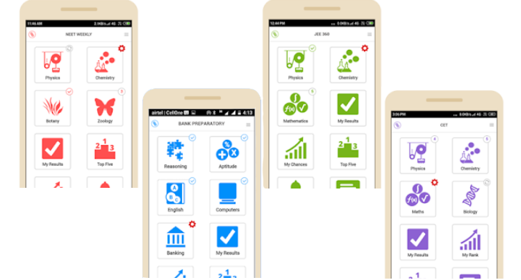
Our first app is CET Social and is on play store for almost four years. Subsequent apps – Bank Preparatory, JEE 360 & NEET Weekly were developed using the same code base. We are going to continue supporting four separate apps as they are meant for different exam patterns.
Moving with times, the design surely needed an overhaul, it was important to re-design the user interface to match with latest standards. We took this opportunity to modify all of our apps to have a uniform design.
VISIT PLAYSTORE
Design considerations
- Distinct theme colors
Each app now use a distinct primary color.
| Apps | Primary color |
| CET Social | |
| NEET Weekly | |
| JEE 360 | |
| Bank Preparatory |
Apps and theme colors
- Progress monitoring
The main screen now shows weekly progress.
| Progress indicator | Description |
 |
Pending weekly update |
 |
Quiz in progress |
 |
Count of quizzes un-attempted |
 |
All quizzes attempted |
Progress indicator and description
- Consistent look and feel
The apps have been revamped to have a greater consistency with regard to fonts, button styles and layout.
DOWNLOAD NEET WEEKLY
Thought for future
Maybe, Questionbang should consider offering a single app to target multiple exam patterns; that would avoid a need for multiple apps for different exams.
Please visit Google Play Store to download the latest version of all apps. We welcome your suggestion, please do write to us.
